
Decoverse
An eCommerce platform that connects and inspire people

Doga Dogan
Starring as UX/UI Designer
Context
Decoverse is an eCommerce platform that helps users find the best collaborators to renovate and buy building products while providing a space for them to share their designs and be inspired by others. They asked us to create their MVP's app and responsive design. By focusing on the entire process—from searching to purchasing to renovating—we develop a platform that supports consumers at every turn and lowers their renovation anxiety.
My role
UX Designer
UI Designer
Platform
Web
iOS
Timeline
2021-2022 (7 months)
Impact
During our collaboration with the client, we successfully create a platform for their different marketplace products in in one unified platform, evidenced by 631.1K visits and solidified by securing a maintenance agreement.
631.1K
Monthly visit (November 2023)
4
Four websites into one marketplace.
1
Maintenance agreement secured
Problems
In the extensive research conducted by the client's research company, along with our own secondary research, we uncovered several problems that users were facing, which shaped our design strategy:
Losing Control
Renovation processes are usually very messy, and scope creep builds users’ anxiety and turns the whole experience into an unpleasant event.
Need for advice
Most of the purchases in building products are highly expensive, users have difficulty choosing the right product. They enjoy browsing and getting inspired by other people’s designs.
Trust issues
Users have complicated feelings towards contractors. They find them unreliable and look for recommendations and safety before choosing one. They’re interested in learning DIY solutions for minor renovations.
Need to touch
Users don’t visit building product stores for just purchasing reasons but enjoy browsing and touching the product before buying. However, the lack of stocks creates annoyance and disrupts the buying process in store.


How might we create a platform that not only connects users with products but also provides them with the guidance, control, and trust they need throughout their renovation journey?
Goals
Post-research, our design goals were distilled into clear objectives:
Create a Unified Platform
Introduce a single, cohesive platform that brings together homeowners, designers, and contractors, facilitating easy exchanges and collaboration.
Building Trust and Confidence
Establish a level of trust between users and the platform, ensuring they feel supported and confident in navigating through what is traditionally an anxiety-inducing process.
Versatile Entry Points for Users
Create a platform that allows users to engage at various stages of their journey, whether they are seeking inspiration, planning tools, specific products, or professional advice.
CONCEPT SOLUTION
Home Journey Compass: Decoverse
The Home Journey Compass concept we designed is to guide users through every step of their renovation and purchase process. It's more than a marketplace; it's an essential tool for inspiration, planning, and accessing expert advice. By providing consistent support and resources, the platform becomes a trusted partner in the user's renovation journey, ensuring a seamless and supportive experience from start to finish.
Inspire Them
Begin where ideas form: Moodboards, seasonal packages, influencer houses serve as a creative entry point, inviting users to start their renovation journey with a burst of inspiration.
Motivate them
Dive in where curiosity peaks: Engaging tools like style quizzes, social media effect provide an entry point for users to translate their inspiration into motivated action.
Help them to plan
Step in where details matter: Planning features offer a structured entry point for users ready to outline the specifics of their renovation project.
Support with expert
Join in where guidance is key: Direct access to experts presents an entry point for users seeking personalized advice to navigate their renovation with confidence.

Concept to MVP
In collaboration with our client, we received a detailed list of required features for our platform. Together, we sat down to strategically prioritize these features, focusing on the most critical elements needed for the initial launch. This collaborative effort helped us define a minimal, yet impactful feature set for our MVP.
For the launch phase, our primary focus was on establishing a seamless purchase process and an intuitive designer hiring system. Users could browse products, add them to their cart, and smoothly complete their purchases. Simultaneously, we emphasized the ability for users to easily connect with and hire interior designers, fostering a dynamic interaction between clients and professionals.
My main responsibilities
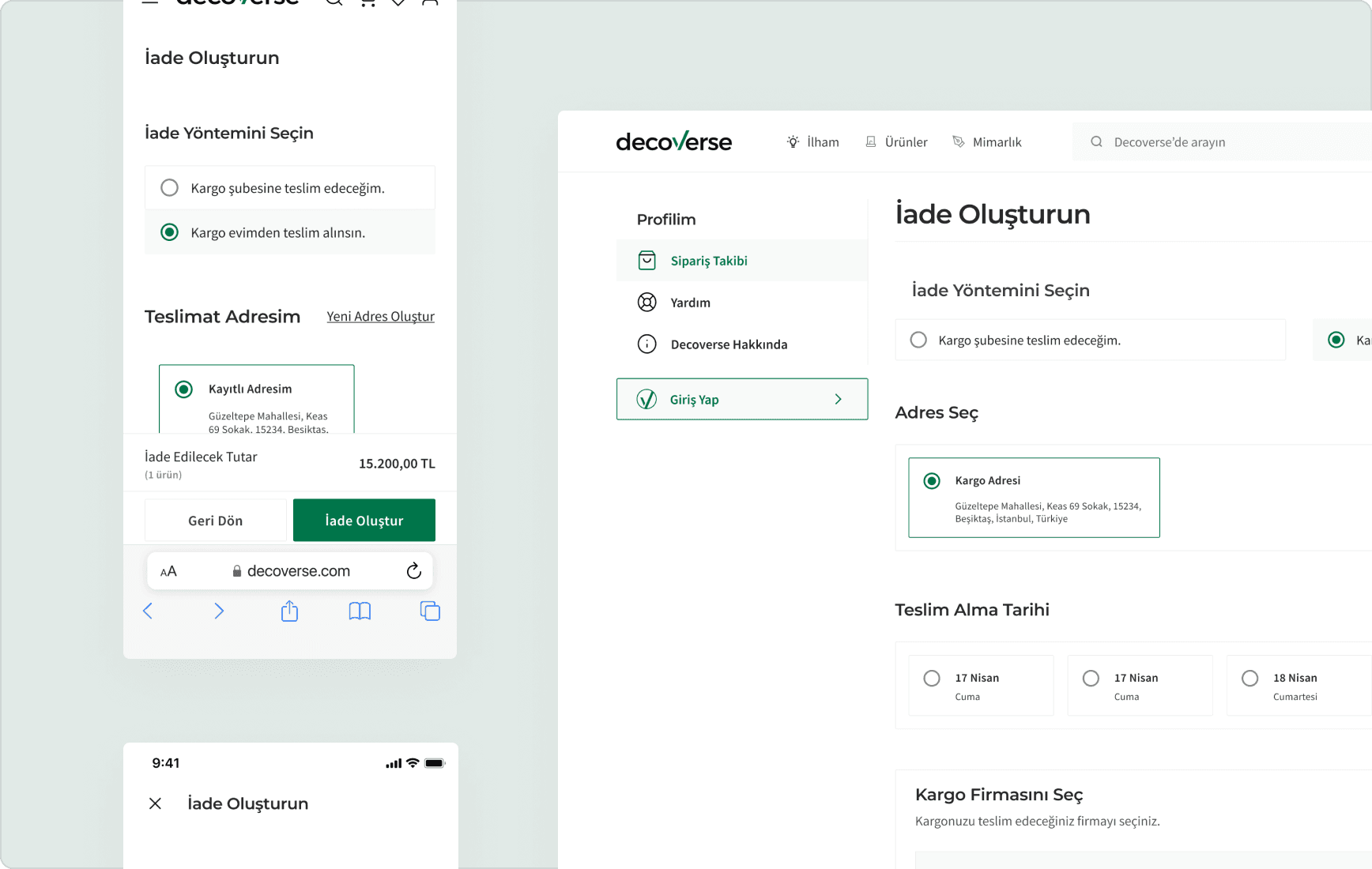
Checkout process
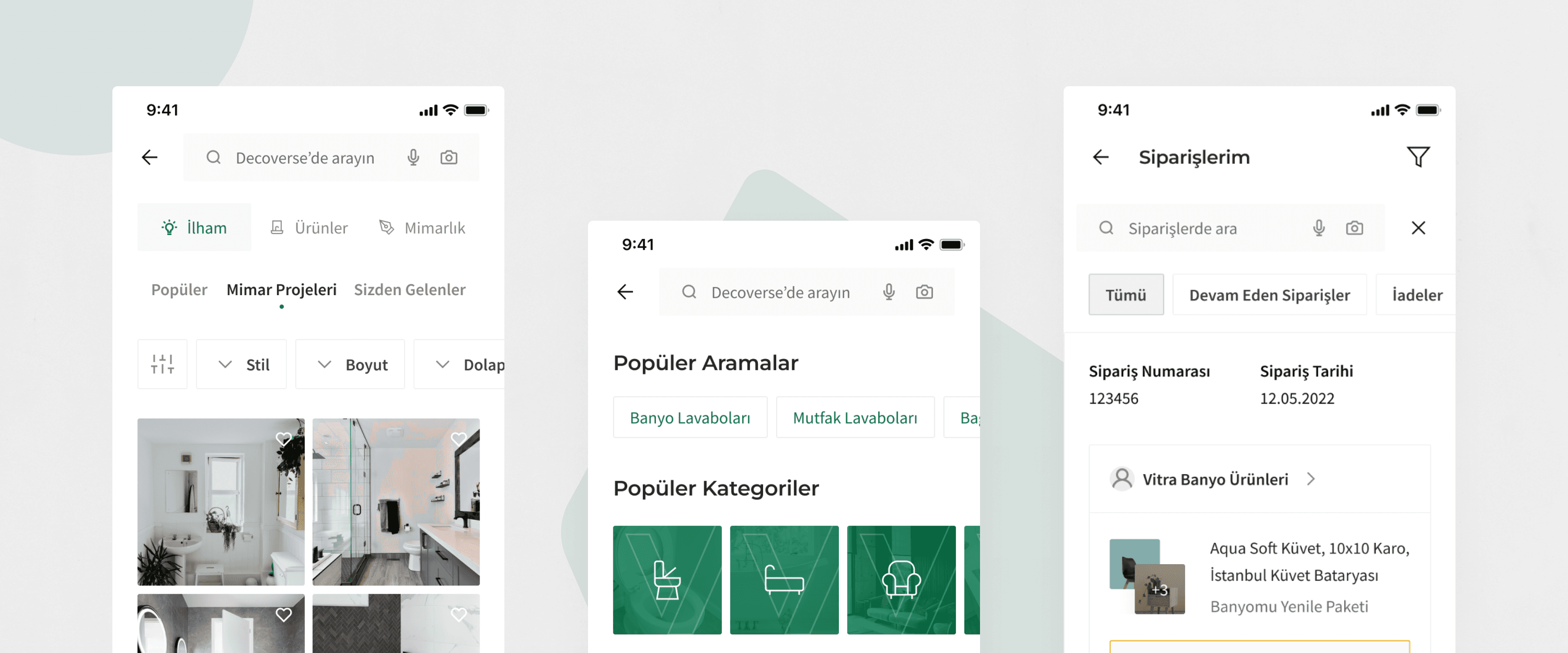
Orders and Return
Profile
Favorites
Solution: Home for Everyone
The homepage serves as a versatile hub, allowing users swift access to shop, collaborate, and get inspired. Our goal was to ensure effortless navigation, enabling users to pivot smoothly to the section that aligns with their current needs, be it on mobile or web. This flexible entry point adapts to the user's evolving journey, inviting them to explore, connect, and inspired. Each section involving their respective focus points.

Solution: Custom delivery dates
The homepage serves as a versatile hub, allowing users swift access to shop, collaborate, and get inspired. Our goal was to ensure effortless navigation, enabling users to pivot smoothly to the section that aligns with their current needs, be it on mobile or web. This flexible entry point adapts to the user's evolving journey, inviting them to explore, connect, and inspired. Each section involving their respective focus points.

Solution: Tracking Multiple Delivery
To enhance user understanding of different delivery times for items purchased in same checkout, the solution was to design an intuitive tracking system. Instead of separating each delivery as a different group, they are displayed together yet clearly distinguished, allowing users to track the delivery status of each item individually within a single, cohesive order summary.

Solution: Profile
Designed as a central hub, the user profile section is a one-stop destination within the platform, simplifying the management of designer packages, orders, workshops, and meeting schedules. It elevates the profile beyond just personal details, offering users a comprehensive space for all their renovation-related activities.

Testing Core Features
After designing screens, to test our core features, we wrote 2 scenarios — one for general users one for experts — for our participants. Our goal was to determine whether or not users can complete core tasks and navigate Decoverse without difficulty.
Scenarios
2
Task Completion Rate
86%
Frames Prototyped
238

Testing Results
During these tests, we encountered various issues across both scenarios. A notable challenge emerged in the checkout section I designed. Participants expressed difficulty understanding the grouped product summary and voiced a need for a clearer, more detailed presentation. Originally, my design aimed to simplify the checkout interface, minimizing clutter. However, feedback highlighted the importance of clear communication, leading me to prioritize user comprehension over a streamlined design.

Takeaways
During the Decoverse project, I gained a clearer insight into the essentials of MVP development. One key takeaway was realizing the importance of concentrating on what's most crucial in the beginning. In designing each user flow, it became apparent how quickly one can get bogged down by various potential scenarios and user requirements. This experience underscored the need to prioritize the most vital functionalities initially, rather than attempting to tackle every potential need from the start.